
Portfolios
Portfolios allow you to organize topics into a dashboard to easily compare them across multiple dimensions and track them over time.
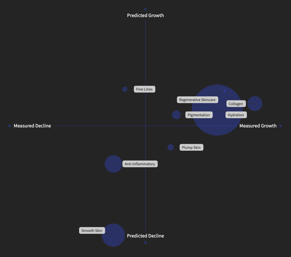
Here’s an example where we are tracking the growth of different skincare trends Once the signals are added, a two by two graph is created. The X axis is the measured decline to measured growth and the Y axis is the predicted decline to predicted growth.
The size of the bubbles corresponds with the absolute score. Below the graphs you can choose not to size by absolute score, flip the X-Y axis, or invert axes.
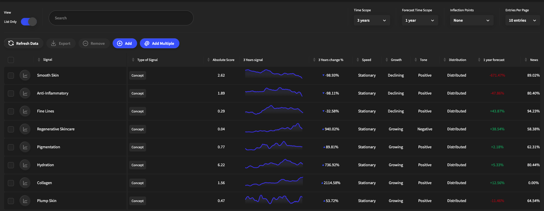
You can scroll over to the list view to see the growth rate, the speed, growth, tone, distribution, forecast over the selected time period. You can also see the breakdown of where the data sources are coming from, the leading indicator across those sources, and the absolute score.
Once you build a portfolio you can access it in the Portfolios tab anytime. You can hit the refresh data for real time updates and add/edit topics at any time.
How To: